the brand
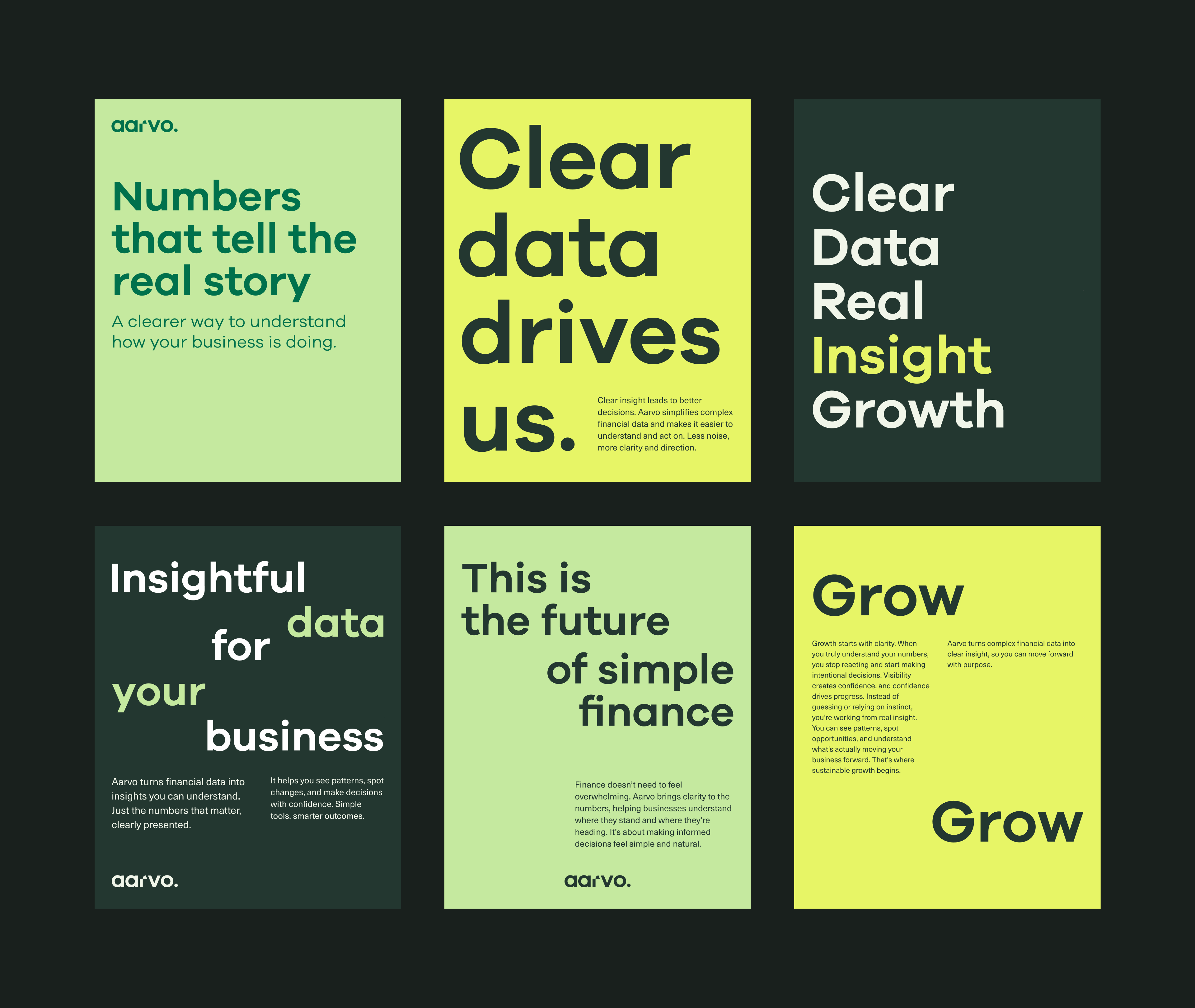
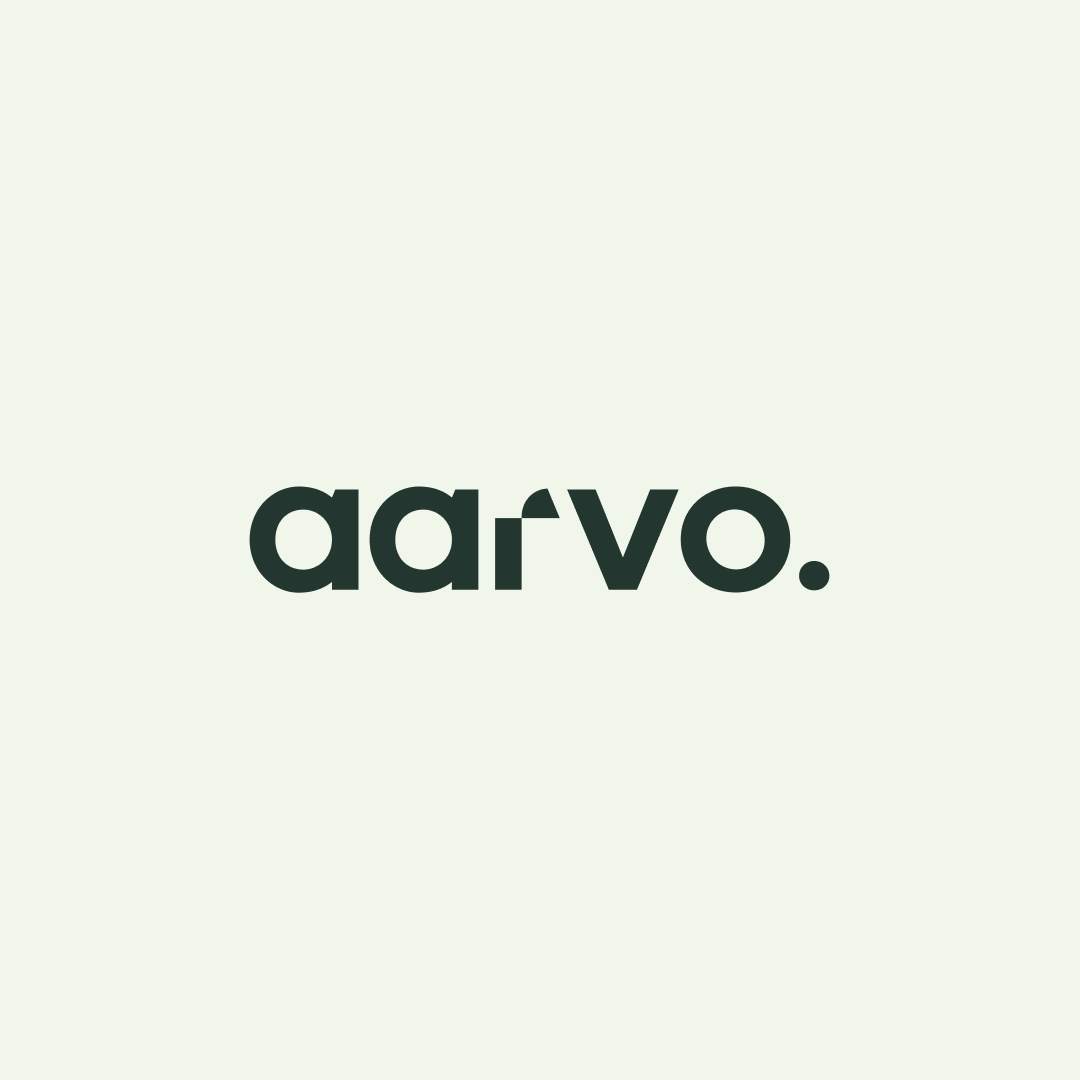
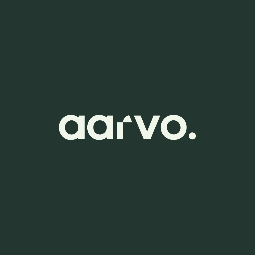
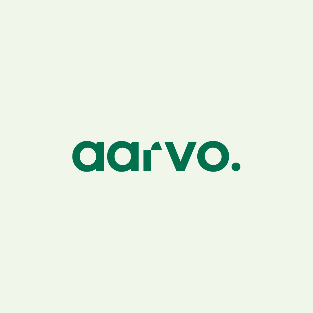
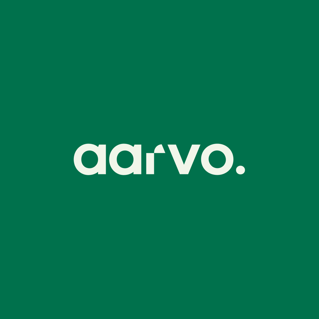
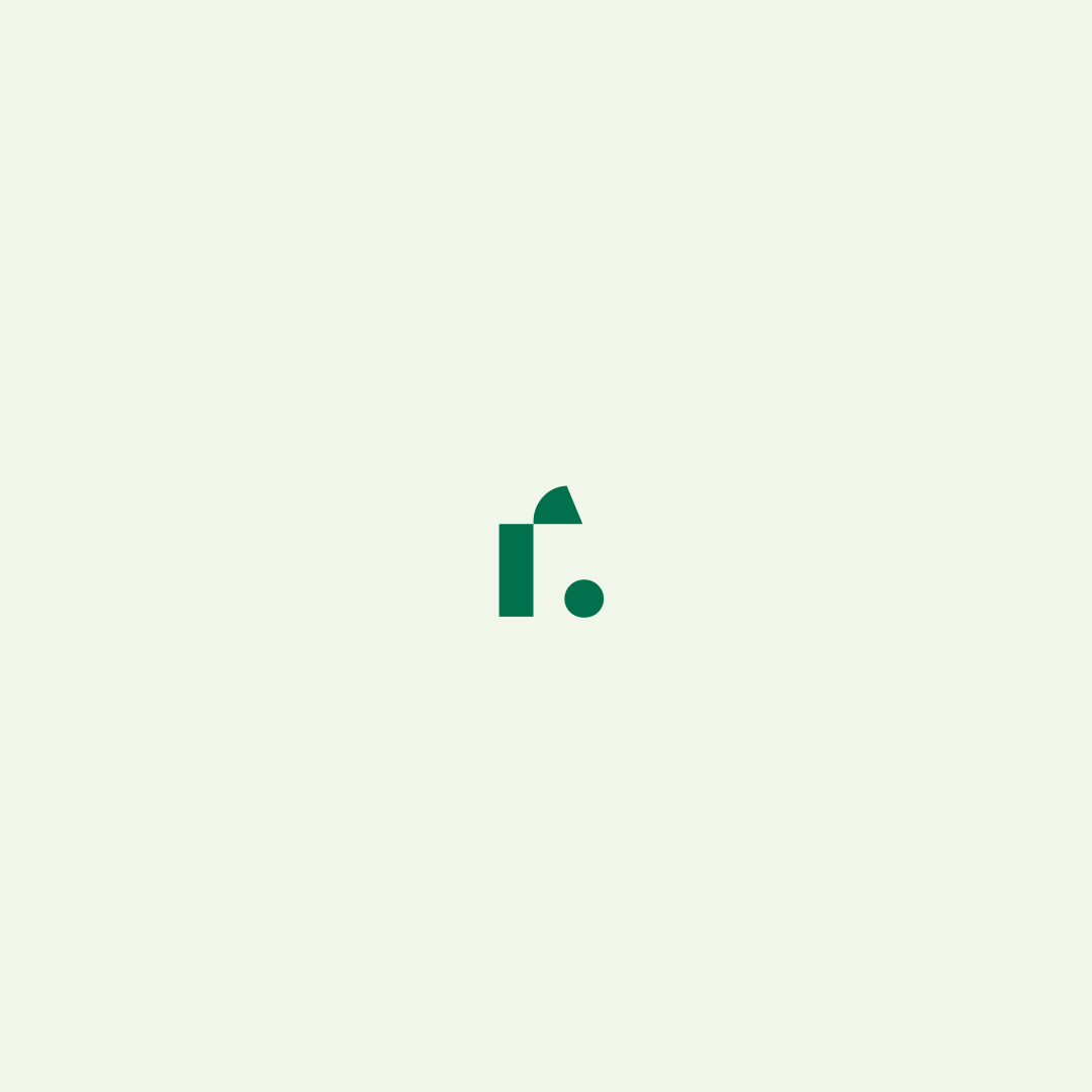
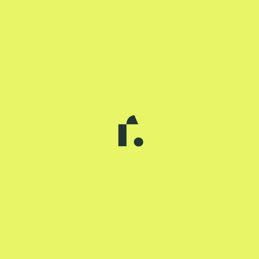
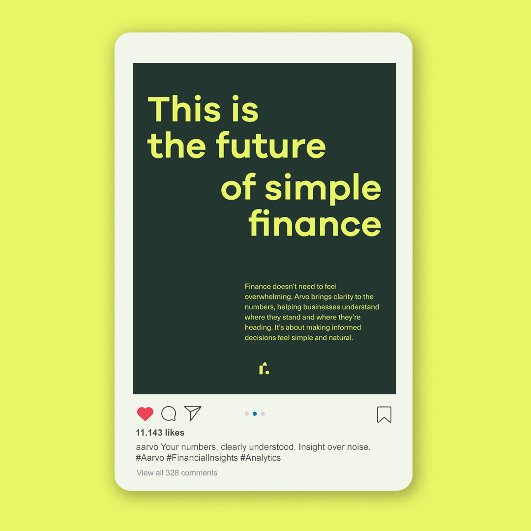
Aarvo is a financial management platform built around analytics. It doesn’t just store numbers, it makes sense of them and turns them into clear, actionable insights. The challenge of this project was to show that intelligence without making the brand feel heavy or technical. The identity leans into clarity and structure. The logo is clean, with subtle angled cuts in the letterforms that add movement and rhythm. It’s simple, but the details do the work.


type and structure
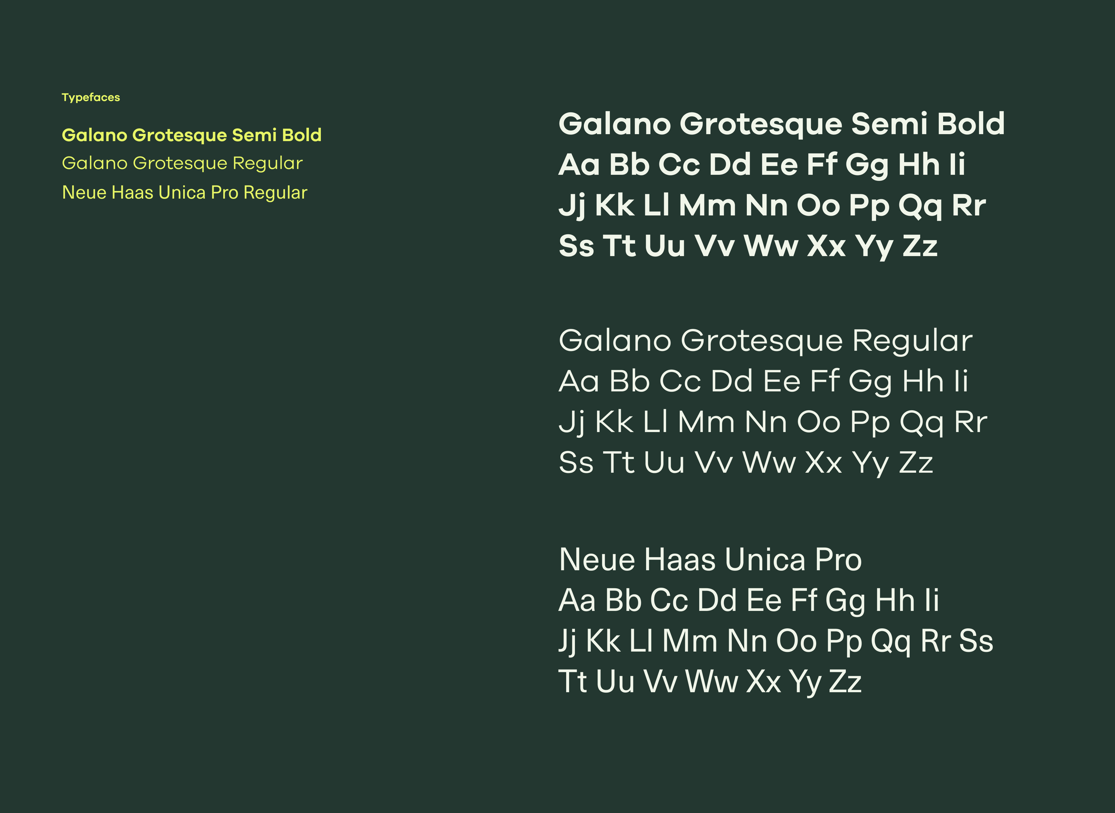
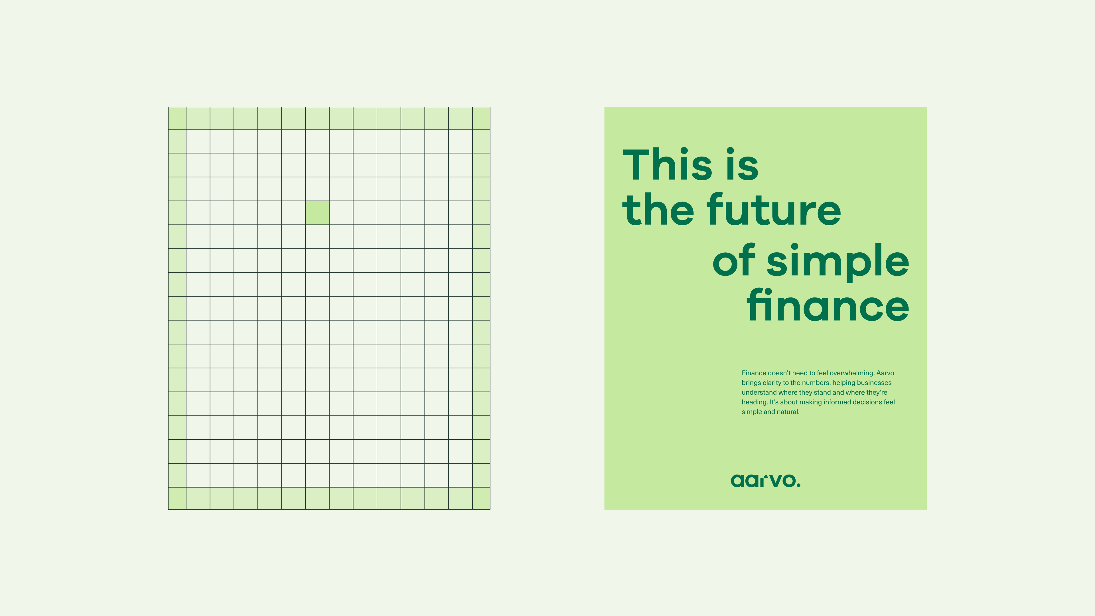
Since Arvo is about making complex information easier to understand, the type system needed to feel calm and clear. Galano Grotesque sets the tone. It’s modern and straightforward. Neue Haas Unica Pro handles the longer copy and keeps things easy to read. The hierarchy is simple, spacing is intentional, and everything has room to breathe.The square-based grid adds a quiet sense of order.
Structured where it needs to be, flexible where it counts.
Structured where it needs to be, flexible where it counts.


the visual tone
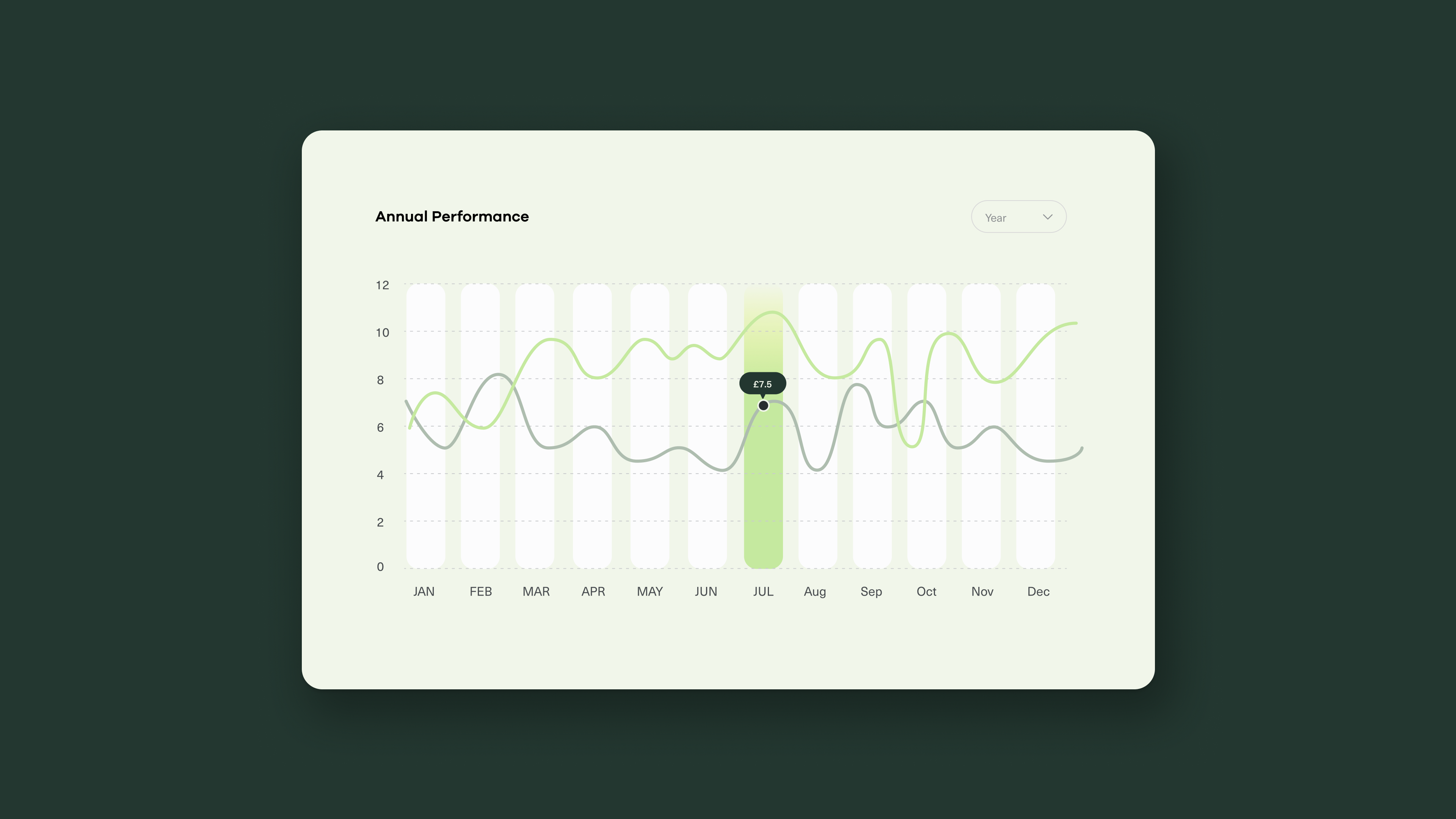
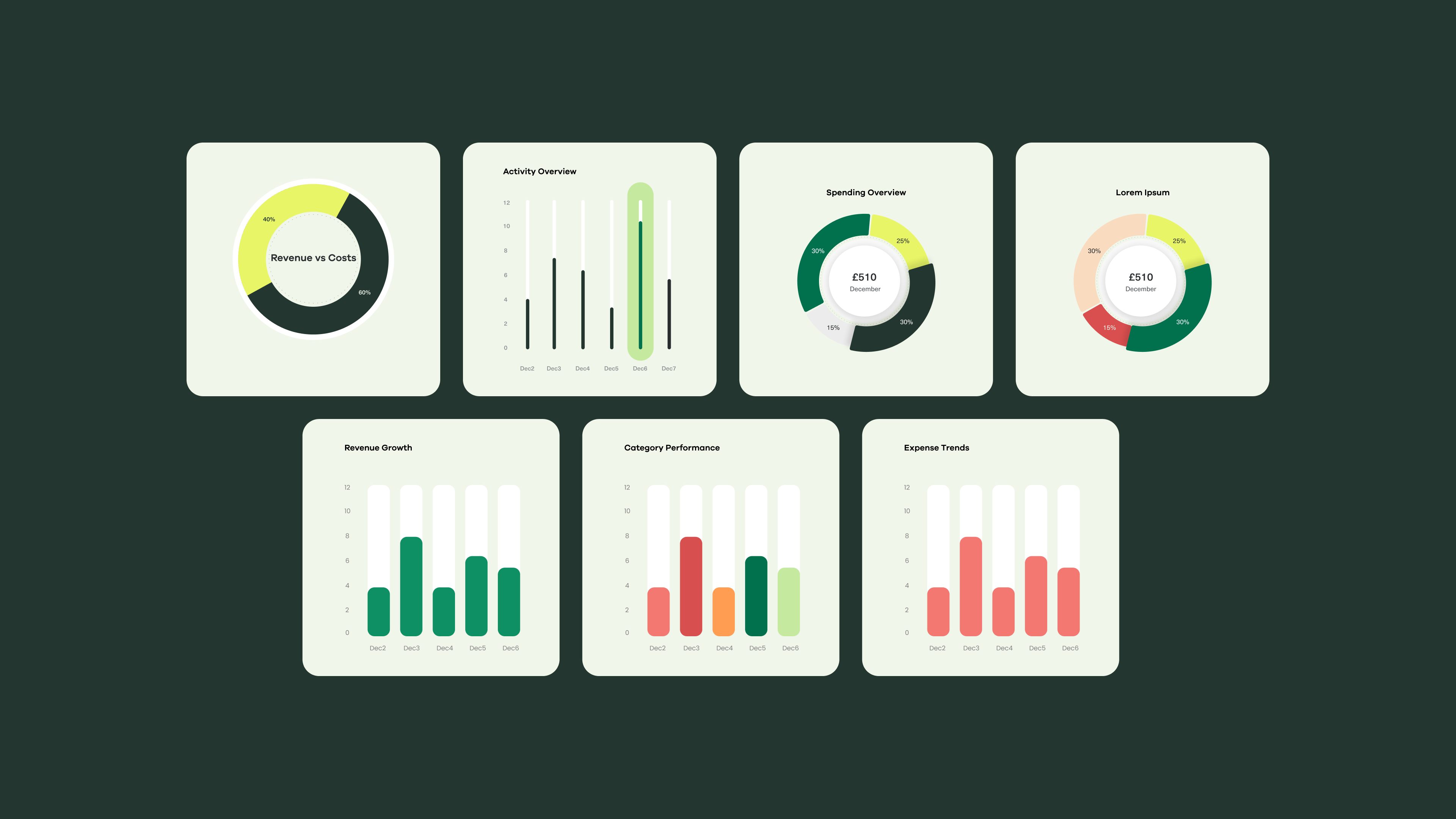
The colour palette leans into green in a way that feels fresh and modern. It creates a calm base that helps reduce visual noise, especially in a space that can easily feel dense and data heavy.
An extended colour palette was created specifically for data visualisation, making complex charts easier to read and navigate. Everything works together to support clarity and keep information simple to move through.
An extended colour palette was created specifically for data visualisation, making complex charts easier to read and navigate. Everything works together to support clarity and keep information simple to move through.