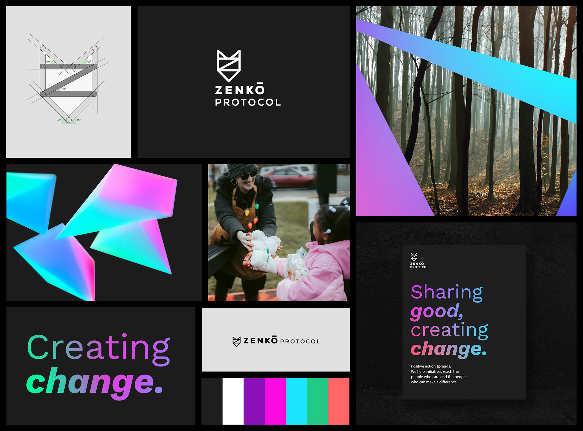
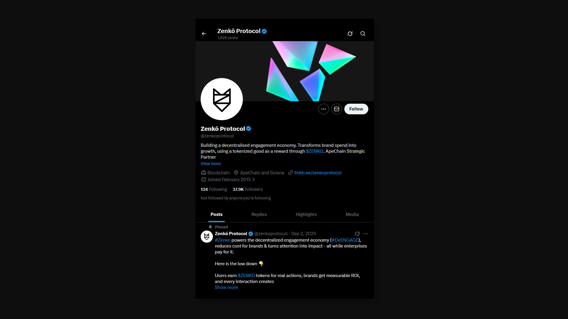
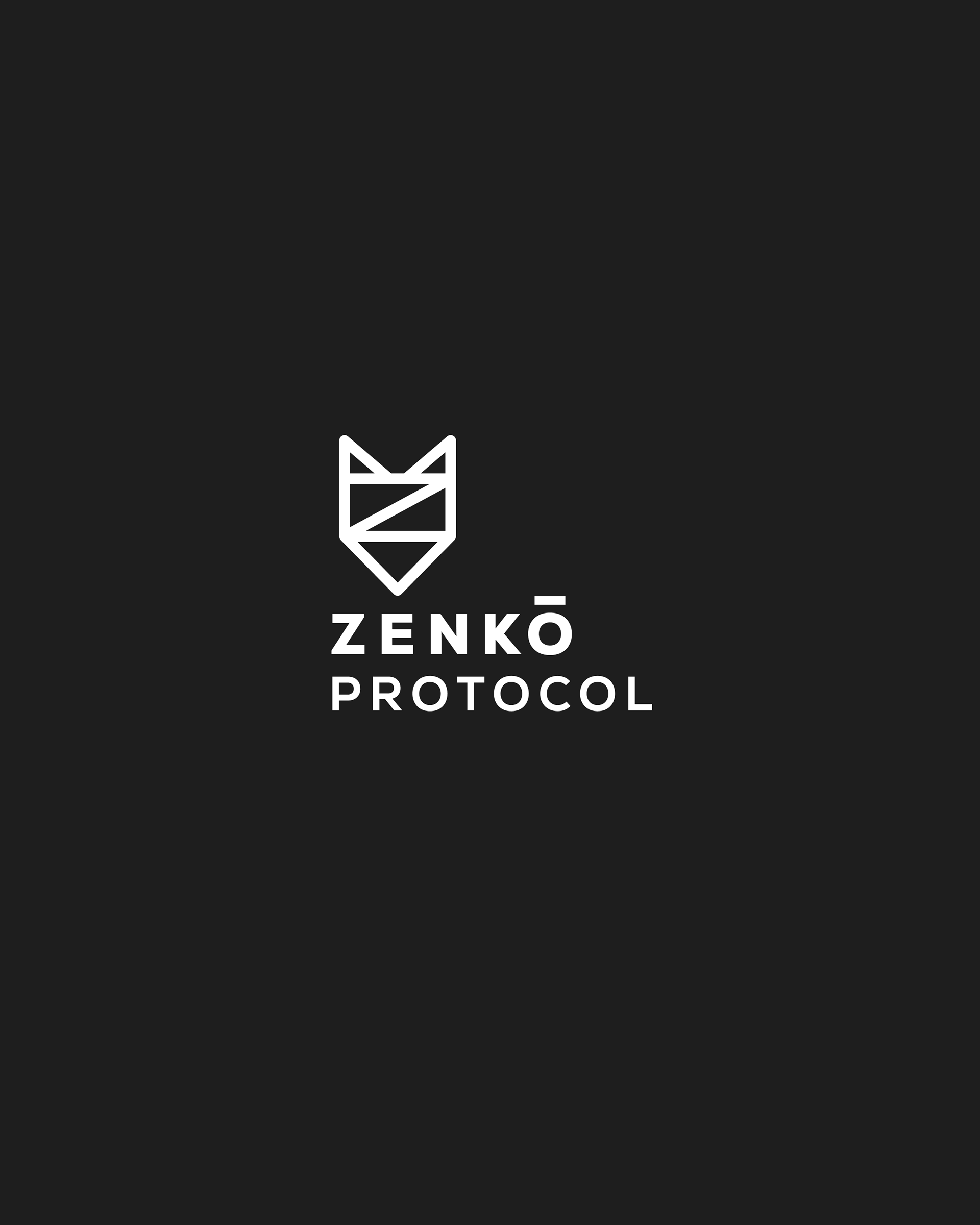
ZENKO
Zenkō (善行) means "good deed" in Japanese, and the brand needed to live up to that. Zenkō Protocol turns everyday actions into blockchain-verified impact, working with major brands and organisations to make engagement actually mean something.
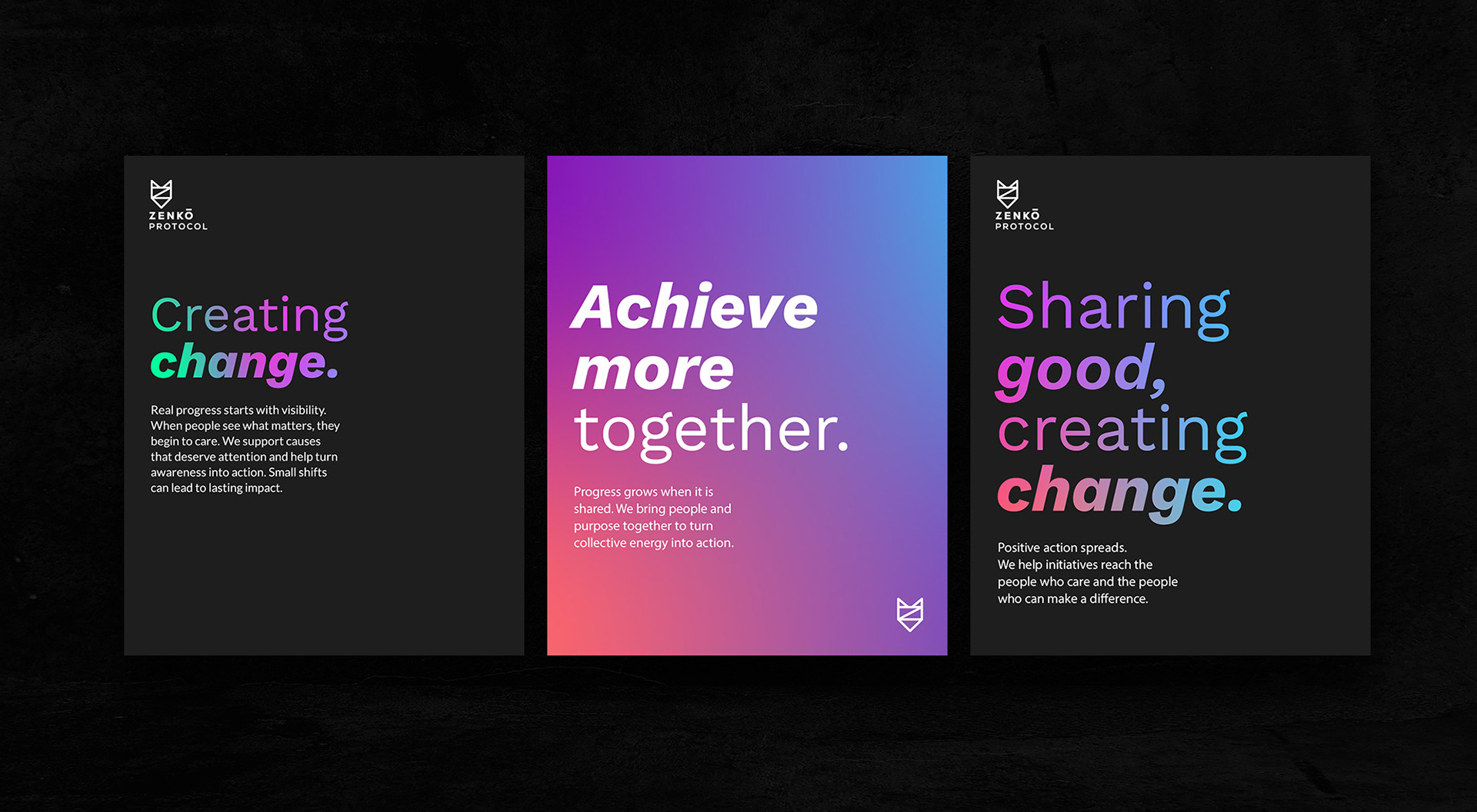
The goal was to create something flexible enough to work across different causes, but consistent enough to always feel recognisable. The identity brings that ambition into focus: bold, confident typography alongside a geometric fox mark built on precise angles, a vivid colour system designed to represent the breadth of causes they support, and a visual language that leans into movement and dynamism at every level, from typography to motion.


typography
Zenkō sits between two worlds: crypto credibility and everyday accessibility. So the typography couldn't lean too far in either direction. Too techy and it feels cold. Too playful and it loses trust.
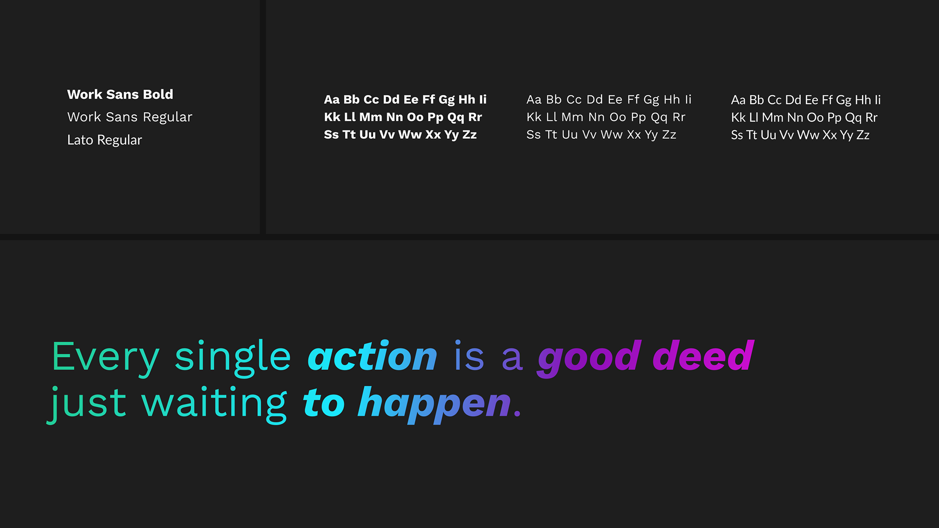
Work Sans hits that middle ground. It's geometric enough to feel structured and modern, but has enough warmth to stay approachable. Using a mix of Regular, Bold, and Italics within a single headline gives each line a natural rhythm. You read it the way someone would say it. Lato picks up the body copy, keeping things clear and comfortable without competing for attention. Both are Google Fonts, which matters for a project that lives almost entirely on screen, fast loading, no licensing friction, and consistent rendering across devices.

putting it to work
A logo and a colour palette don't mean much until they're out in the wild. This is the brand working across real touchpoints, from social media profiles to posters and promotional materials. Every piece follows the same angular, off-centre design language, so whether someone encounters Zenkō on X or on a printed poster, it feels like the same voice.